Dove Magazine Ad Uses Carbon Paper to Show How Abusive Words Don’t Fade

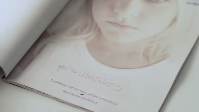
The Dove Self Esteem Project and agency Torke+CC in Lisbon, Portugal, placed an ad (and a pen) in a parenting magazine and asked adults to write down the worst thing they remembered being called as a child. When they turned the page, the disparaging remark was printed (thanks to a hidden layer of carbon paper) across the shirt of a child—to illustrate that "Words mark children forever." The initiative increased the project's local Web traffic 20 percent and helped get schools involved in the program. That's all to the good, but I can't help feeling that the campaign's central metaphor is lacking and dilutes the overall message. A shirt is easily removed and discarded. It's highly impermanent. The pain of verbal abuse is more like a tattoo or a wound, something carved or seared into flesh that leaves its victims more permanently disfigured. Of course, attempting such visceral imagery, especially when kids are involved, might have provoked an outcry against the campaign itself. As it is, the work is well-intentioned and makes its point, but doesn't truly capture the lasting horror of abuse that can indeed scar or brand children for life.


Microsoft Ad Turns Forbes Print Magazines Into T-Mobile WiFi Hotspots

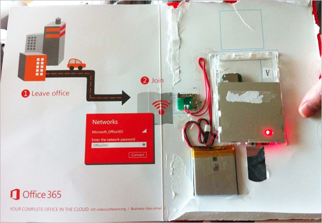
Microsoft stuffed a functional WiFi router into a limited number of the most recent issue of Forbes, perhaps inspired by Entertainment Weekly's use of tiny LCD screens in one of its print issues last year. Microsoft's ad, which is for Office 365, is a T-Mobile wireless router that provides 15 days of free WiFi with a two- to three-hour battery charge. Wasteful? Sure. Needlessly expensive and complicated? Totally. But it's also the coolest thing Microsoft has done in a while. Same goes for Forbes—well, along with giving NAH's newest album a thumbs-up. Via PSFK.


Incredible Cover of Boston Magazine Made of Shoes Worn in the Marathon

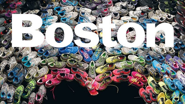
The stunning May cover of Boston magazine features a photo of shoes worn in this year's Boston Marathon, arranged in a heart shape. "We will finish the race," says the cover headline. Tragedies often bring out the best in magazine designers. Other notable Boston Marathon covers include those from The New Yorker and Sports Illustrated. And then, of course, there was the incredible Hurricane Sandy cover of New York magazine.

UPDATE: The back cover of the magazine is pretty great, too. (See below.) The magazine has also posted a blog item about the cover. An excerpt:

Our design director, Brian Struble, and deputy design director, Liz Noftle, came up with the concept of taking shoes worn during the marathon and arranging them so that the negative space is in the shape of a heart. … I knew as soon as I heard the idea that we had our concept—not just for the collection of essays, but also for the cover. In fact, I quickly realized that the stories of the runners who wore those shoes would be even more powerful than the essays we'd commissioned. We quickly changed course and settled on the cover concept and the outlines of a feature package: We'd shoot the shoes collectively to form the heart, but we'd also photograph them as individual pairs to illustrate the stories told by the runners in the package (which we called "The Shoes We Wore," and which you'll find in the May issue).


The New York Times Defends Putting Ad With Bloodied Man Next to Bombing Coverage

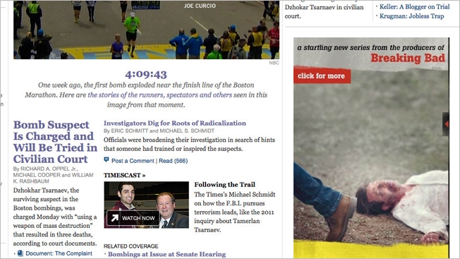
The New York Times took some heat from readers on Monday for allowing an online ad showing a bloodied man lying on the ground to appear next to coverage of the bombings in Boston. The ad, for the Sundance Channel show Rectify, received enough criticism that the paper's public editor, Margaret Sullivan, weighed in with a piece Wednesday—giving some background and confirming that the paper did indeed approve the juxtaposition, and that it wasn't just some oversight. "This did not feel like it crossed the threshold," the Times's ranking advertising executive, Todd R. Haskell, tells Sullivan. Haskell says that by Monday, it had been a full week since the bombings, which made the ad more acceptable. "We try to be as respectful as we can but these are subjective calls that we make in real time," he adds. (The show premiered Monday, which also made it more difficult to move it to a later date.) Sullivan ends up agreeing with Haskell and with Richard J. Meislin, a former associate managing editor who now is a liaison between the newsroom and the ad department, who said he thought the juxtaposition was "unfortunate, but it did not cross the line to the point where we would ask that the ad be taken down." What do you think?


Chicago Tribune Buys Pizza for Boston Globe After Last Week’s Hell Week

The Chicago Tribune really, really loves Boston. Following the moral support it showed last week in the wake of the bombings at the marathon (via an impressive stunt on the front page of the sports section), the Trib today doubled down by sending dozens of pizzas to the Boston Globe—a free lunch as a gesture of thanks and respect for the exhaustive and exhausting coverage the Globe reporters and editors churned out under difficult circumstances. "You make us all proud to be journalists," read the accompanying note. It's a wonderful gesture, and clearly appreciated by the Globe staffers. Some will say it's starting to feel a bit like an image campaign for the Tribune. But even so, who cares? Someone there is taking the time to show a little empathy and respect—two things that could be in greater supply at almost any news organization these days.


Chicago Tribune Honors Boston With Amazing Tribute From One Great Sports Town to Another

Here's a pretty incredible piece of editorial from the front page of the sports section in Tuesday's Chicago Tribune—a tribute to Boston following Monday's bombings that turns all Chicago sports fans into Boston fans. It's being hailed almost universally as a tremendous gesture—with the Red Sox themselves being among those already expressing their thanks.