Proximity Russia Repurposes Retargeted Ads for 3M

Proximity Russia pulls off the neat trick of finding a practical purpose for retargeted ads in its latest effort for 3M.

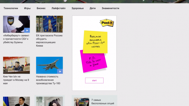
The agency collaborated with different banner networks in Russia to implement a technology that transforms retargeted banner ads into virtual post-it notes that users can customize. As Adweek points out, this turns retargeted banner ads’ weakness — they keep popping up, over and over again — into a strength, as it allows users to create messages to remind themselves of important information. Like the banner ads they replace, the notes follow users from site to site, but they turn what would be a nuisance into a useful tool. It’s a clever trick that doubles as a covert ad for 3M’s Post-it notes, illustrating their usefulness.

Credits:

Client: 3M
Marketing Supervisor: Sergey Smolentsev
Marketing Coordinator: Yulia Smirnova
Agency: Proximity Russia
Creative Director: Andrew Kontra
Senior Copywriters: Polina Zabrodskaya, Anna Migaleva
Senior Art Director: Fernando Muto
Business Development Director: Mikhail Vdovin
Digital Director: Alexander Makarovsky
Senior Account Manager: Polina Zvereva
Digital Production House: INDEE Interactive
Producer: Alexey Zinchenko
UI designer: Egor Bernikov
Coders: Arina Vernidub, Andrey Zakurdaev, Oleg Nikanorov

3M Makes Retargeted Banner Ads Less Annoying by Turning Them Into Post-it Notes

Retargeted banner ads are the sledgehammer of the web, bashing you again and again with the same random product you looked at once, whether you like it or not.

But 3M figured it could use the retargeted banner’s weakness as a strength. If the same banner comes up again and again, the company figured, why not make it a Post-it note where you could jot down info that might be useful later—when the ad pops up again?

Proximity Russia did just that in a recent campaign. Check out the case study below. It seems like ad-blocking software, but it’s not. 3M simply used retargeting technology and gave it an interactive spin.

The agency collaborated with several banner networks to get the Post-its on top websites in Russia. Clicking on the banners led you to a Post-it page, where you could create more stickers, edit or delete them all.

CREDITS
Client: 3M
Marketing Supervisor: Sergey Smolentsev
Marketing Coordinator: Yulia Smirnova
Agency: Proximity Russia
Creative Director: Andrew Kontra
Senior Copywriters: Polina Zabrodskaya, Anna Migaleva
Senior Art Director: Fernando Muto
Business Development Director: Mikhail Vdovin
Digital Director: Alexander Makarovsky
Senior Account Manager: Polina Zvereva
Digital Production House: INDEE Interactive
Producer: Alexey Zinchenko
UI designer: Egor Bernikov
Coders: Arina Vernidub, Andrey Zakurdaev, Oleg Nikanorov


‘World Under Water’ Uses StreetView to Visualize Flooding From Climate Change

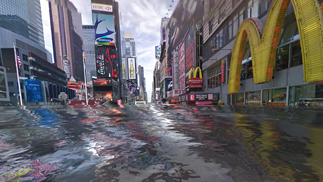
If this week's news of a potentially disastrous Antarctic ice melt wasn't enough to give you a sinking feeling, then you might want to check out "World Under Water," an interactive initiative that lets people see what their neighborhoods might look like following floods caused by climate change.

BBDO and Proximity Singapore created the site for CarbonStory, a crowdfunding platform, ahead of World Environment Day on June 5. The site includes most areas on Earth catalogued by Google StreetView.

"This is an emotionally engaging consumer experience that we hope will change behaviors," says Ronald Ng, CCO of the agencies that crafted the work. The goal is to convince folks to calculate and offset their carbon footprint and hopefully slow global warming and the melting of the polar ice caps.

The campaign's timing is prescient, as NASA just determined that melting ice sheets in Antarctica could cause higher global sea levels than previously anticipated. Luckily, that process should take a few centuries, so in the meantime we can use CarbonStory's tool to preview the potentially soggy world of our descendants.

At least one scientific researcher, Philip Orton of the Stevens Institute of Technology, says World Under Water's approach is all wet. Interviewed by Mashable, he dismisses the campaign as an "information-less thing that just demonstrates what it looks like to have water on your block (be it Denver or Charleston). It has very little actual information content."

Typing in my location generates an image of waves rushing down the street, covering cars and lapping at second-story windows. But with all the rain we get here in Boston, it always kind of looks like that anyway.