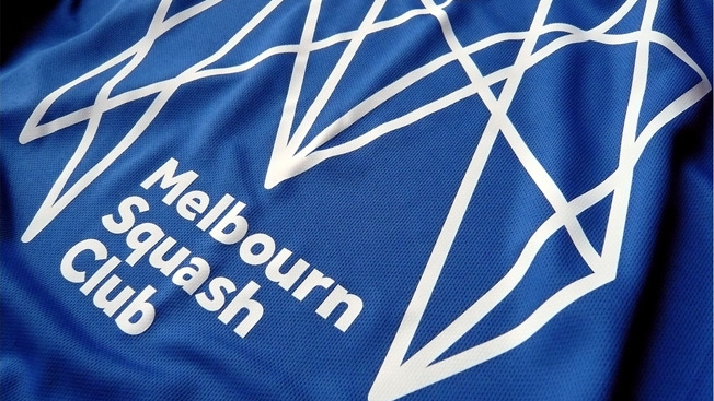
This Zigzag Logo Looks Crazy. But Given the Brand, It's Pretty Brilliant
Posted in: Uncategorized
Anyone who’s played squash knows it’s a frenetic game. Now, one British squash club has a fascinating new logo to match.
Melbourn Squash Club‘s new branding features a web of zigzag lines designed to look like a capital “M.” Created by Distil Studios, it’s meant to capture the spirit of smacking a ball back and forth against a wall with a racket.
The design studio explains on its site: “Avoiding generic silhouettes of players or two crossed rackets, our inspiration comes from every thwack, thud, squeak and sneaky drop shot to form their unique club initial.”

Distil creative director Neil Hedger tells Logo Design Love that the original sketch was pretty complex, and that the agency tried to simplify it—but in the end, couldn’t. “Some of the more simple approaches just lacked the energy of our original thought,” he says. “We kept much of the complexity of our first draft and opened up the spaces in between to help visual clarity. The rebounds from the left and right provide a much stronger form. We also put in just a couple of curved sneaky drop shots to break up the rigidity of the lines.”
Hedger adds: “To reflect a true squash match (and for animating the lines), we made sure the icon was formed from 2 continuous lines.”

Fast Company calls it “perfect.” For sure, it’s unusual and eye-catching. It actually seems to look kind of sinister, not unlike a mechanical spider. Or maybe “M” is for Mordor.
What do you see in this logo Rorschach test?
![]()

Post a Comment