
Canal+ Makes Clever Use of Its + Symbol in Redesigned Movie Posters
Posted in: Uncategorized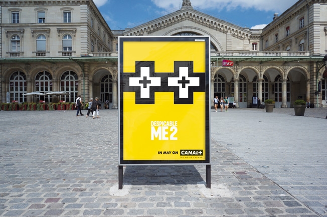
This Canal+ campaign, which uses the French TV channel's trademark "+" symbol as a visual cue in a series of reimagined movie posters, sure has lots of positives.
The work was created by BETC Paris to celebrate the 67th Cannes Film Festival (which runs May 14-25) and will appear as outdoor and print advertising during the event. Nine movies screening on Canal+ are featured, including Despicable Me 2, Fast & Furious 6, Star Trek Into Darkness and Man of Steel. The "+"s on these particular posters work extremely well, replacing, respectively, a Minion, tire tracks, stars in outer space and the stylized "S" on Superman's chest.
Canal+ has produced notably offbeat advertising in recent years, including ads with bears and dwarf clowns (via BETC) and a mockumentary about the guy behind Hollywood's most famous scream (via FCB).
The original poster artwork for many of the films in this latest campaign was intricate and memorable. (Trek's was quite dynamic, casting the outline-shape of the Star Fleet uniform badge as a dramatic "window" framing device.) Even so, the simplicity of Canal+'s sleek, stripped-down approach offers an uncluttered, clever homage that ultimately amounts to addition by subtraction.


CREDITS
Client: Canal+
Brand Management: Alice Holzman, Élodie Bassinet, Anne-Gaëlle Petri, Coline Andre
Agency: BETC, Paris
Agency Management: Bertille Toledano, Guillaume Espinet, Elsa Magadoux, Hugo Chavanel
Executive Creative Director: Stéphane Xiberras
Creative Director: Olivier Apers
Art Director: Jordan Lemarchand
Copywriter: Julien Deschamps
Traffic: Coralie Chasset
Production: Sarah Belhadj
![]()
Post a Comment