National stereotypes still score for Euro 2016 brands
Posted in: UncategorizedNational stereotyping is alive and well in the campaigns of official Euro 2016 sponsors, with the English, French and Germans getting the caricature treatment by Mars, Carlsberg and Lufthansa respectively.
‘Hansaplast Junior’ Redesign by Wow Design
Posted in: UncategorizedDesiCreative
DesiCreative – Indian Advertising Creative Blog and Community (beta 1.4)
What is Hansaplast?
Hansaplast is a healthcare brand of Beiersdorf, one of the leading skincare companies worldwide, situated in Hamburg, Germany. For more than 125 years, Beiersdorf, has gained experience and competence in wound care, more recently in the field of activity support and treatment of muscular pain as well, striving to improve wound healing and care for your skin ever since.
What is Wow Design?
WOW Design is a specialized strategic brand design company. In a span of 6 and half years, it has grown from a team of 3 members to a team of 40 members. The company focuses on its core services of Branding- Brand Strategy & Visual Brand Identity, Packaging Design, Retail Communication and Space Design.
WOW Design’s philosophy is to give solutions that are thoughtfully fresh.
We at WOW practice strategic methodology, which ensures that the solutions we give, add manifold value to the Brand image and ultimately meet the marketing objectives. This approach has enabled us to grow healthily with its service offerings in various sectors, FMCG being one of the key sectors of operation. In last six years, WOW Design has successfully partnered with a number of FMCG majors as Clients: ITC, AMUL, JK Helen Curtis, Cavin Kare, Biersdorf, BERGER Paints, PIRAMAL, Abbot , DABUR , PARLE , JYOTI Laboratories etc. The list of clients we have worked with is more than 60 and the number of brands we have imparted our WOW touch are over 100.
WOW design has been successful in implementing effective brand strategies in the NON – FMCG sectors in as well and has robust plans to extend its expertise into tapping the same in the coming years. Automotive, Education being the key focus areas. Having just crossed over couple of year from being a startup brand Company,
We understand how the startup environment growth is elemental in boosting the nation’s economy. We also understand that Branding plays significant role for startups. Hence WOW Design has planned to play a significant role in the startup eco-system, to partner with the startups in planning and implementing effective Branding Strategies.
What was the brief?
Hansaplast wanted to launch a range of designer plasters especially for the kids. The designs developed for the plaster were segregated into four subcategories- being brave, being stylish, having a hobby and lastly expressing him/her. The brief was to give Junior and its sub categories a personality through a suitable name for each category and develop packaging for the same that would not only appeal to the TG but also convey the objective of the product very effectively. Phase II of the brief was to communicate the new brand launch in retail space to create awareness and sales at the point of sale
How was the solution arrived at?
Since the product was very clearly targeted to the kids, our first step was to understand our TG well. We planned a dipstick research for the same with a list of relevant questions as to what they do, what they aspire for, what is their lingo and many more which would open the doors of their world. While gathering insights was one aspect, we even focused on what were the parameters of attraction and selection of packaging when it came to kids. We strategized to seek a fine balance between the seriousness of the category, which was wound care, and the age group for which the brand was targeting. This led to coming up of one of the ideas to portray the plasters as a tattoo & bringing out the flaunt factor very strongly as the final outcome.
What were the results of the solutions?
The understanding and the strategy behind the solution resulted in achieving the objective of the brief effectively. The packaging has a very high impulse value and can appeal to both the kids and their parents. We made sure that we did not portray any extreme behavioral trait in kids on any of the sub categories and stayed away from tactical gimmicks.
Each pack clearly communicates the individual category of a plaster it carries; while they all belong to one brand. The retails solutions have created a lot of buzz and excitement in the otherwise mundane category of healing plaster. We do not have the accurate details on the sales figures yet, however the results have been very impactful in the market.
Parents are the decision makers who obviously have the purchasing power for buying products for their home. Why was your team’s focus on targeting the children and not their parents?
Today marketers are relying on kids to pester their parents to buy products rather than going straight to their mom/ dads. This is because once the children are convinced; they can easily influence their parents and give them enumerable reasons for purchasing the product as the product gives them happiness. Kids represent an important demographic to marketers because in addition to their own purchasing power (which is considerable) they influence their parents’ buying decisions and are the adult consumers of the future.
Today’s kids have more autonomy and decision-making power within the family if compared with previous generations. Hence, kids are more vocal and opinionated about what they want their parents to buy. Marketing to children is all about creating pester power, because advertisers know what a powerful force it can be.
Companies today are tactfully adopting innovative, creative strategies to lure kids exclusively for everything. We mean ‘EVERYTHING’. This does not merely encompasses clothes, breakfast cereals, family entertainment trips etc., but even a brand of medical plaster like HANSAPLAST is pestering kids to take a decision on behalf of their parents.
In context of medical plasters, consumers have a very mundane perspective and generally retailers allot a functional and boring space for the same. Was it a struggle for your team to convince and alter the attitude and approach of the retailers for giving a more visually appealing retail space and presence?
The objective of this brand was to break the mundane perspective and create an excitement. We do agree that both the consumers and retailers have a very functional place for this particular product in their minds. However the packaging solutions that we came up with were with an objective to create the excitement in the space and further on makes space in the impulse buying section.
Even though getting the retail space was not really in our scope, we were able to convince the client with our design strategy to be able to garner the desired retail space assuring the retailers of the newness and the potential of the brands innovative product. The fact that the product was being launched by Hansaplast, a trusted name in the category boosted the acceptance. Once we fixated on the available touch points we made sure that we created enough disruption in the boring category for people to stop and notice the product.
How do you think the market of medical plasters has evolved and grown over time? And speaking of sales, do factors like packaging, advertising, etc make a difference for the same?
The findings of our secondary research were that the medical plasters category is getting technologically advanced for better and faster healing. It has moved way beyond just primary wounds to orthopedic healing and post operative care. While most of the curative plasters are prescribed by the doctors, the majority of the products in the day to day healing category are OTC products and it becomes very important to communicate the benefits and application of the same. That is how the packaging and advertising plays a role. Hansaplast itself works on principle of open innovation. The range of 210 designer plasters for kids is first of its kind in this category and packaging and communicating it right will definitely play a pivotal role from the sales point of view.
A New engaging look has been created by your creative team. Share with us the concept behind it.
After an in-depth research on how kids relate to wounds, we learnt that a painful injury can be spotted through a different perspective. We wanted to make the process of healing, fun and engaging! When it came to think of a design solution, the core thought was to offer the kids a combo of fun and courage to keep going .The competent nature of today’s kids, their aspirations and daily activities played a pivotal role in building up the “Never give up “concept in terms of branding and its variation.
The name ‘Junior’, as a sub-brand, communicated a series of fun plasters for kids. Wow Design introduced four variant names & colours, each depicting its own personality trait for the sub-ranges in which the 210 designs were classified;
• Red for bravery, was termed- ‘Daredevil’
• Green for a kid’s style quotient ,was named- ‘Style O’
• Yellow for a kid’s artistic capabilities, was named ‘Doodle’
• Blue illustrates the fascination through the name-‘Wow.’
The story on each pack is tactfully weaved in the product and certain elements are highlighted via 3D extrusions.
What was the main idea behind the new retail presence for the brand?
The most significant objective over here was to get an impulse purchase at retail touch points. It was challenging as the space for medical plasters are executed in a functional manner, leaving a mundane impact on its consumers. Therefore, we gave a visual featuring a kid proudly flaunting the wound with an ‘attitude’, in a ‘stylish’ way and the headline talking to the consumer in a call for action manner. A play of vibrant colours added to that attraction quotient. The entire POSM (Point Of Sales Material) campaign for Hansaplast Junior raised interest amongst the kids.
You have introduced four new variant colours- Red, Blue, Yellow and Green with different names. Do you think kids can relate to the respective personas for each color- Daredevil, Wow, Doodle, Style O?
Like I mentioned earlier we did dipstick research with the kids to understand their concepts of colors, forms etc and applied it with our semiotic understanding of how the color theory works to create various impacts . Just to give a gist,
Red as a color is used to symbolize both danger and power, hence it evoked positive response in context of daring similarly yellow stands for brightness, light, spark of creative ideas. Its bright and hence used for the sub range of the creative – artistic
Designs.
Do you think you have a cutting edge over the competitive market leaders as your main focus is long term and not merely immediate sales? Please elaborate on the same.
We wanted to focus on the brand’s core offering and occupy a space in the consumers’ (kids’) head which is full with so many brands offering a lot of tactical gratification today. Be it freebies, association with cartoon characters and works, but these tactics unless practiced consistently don’t help the brands to grow long term.
Therefore, we thought of an optimistic approach in the context of getting hurt or wounded. Today’s kids are outgoing and are involved in interactive and fun activities. Another insight was that they love to flaunt their belongings and are attracted to vibrant colours, unique shapes and whimsical facial expressions. Keeping all of these factors in mind, we came up with the core concept of Healing in style. We tried to communicate that as you’re growing up, each time you fall or hurt yourself, you become an inch stronger, so if you get hurt, flaunt your wounds in style. It was very vibrantly translated onto the packaging and the retail communication.
Your team introduced the concept of “Healing is Fun”. Did your team conduct a survey for the same that led to coming up with this concept?
We did a dipstick research before strategizing for this project on a more holistic level. There were several striking insights such as –
• Kids hate to sit around even if they are hurt,
• They look and react to wounds differently and each one has a story around it
• They have a fetish for collecting images, things etc which they like or which reflects their personality in one way or another.
Delving into a whole lot of such insights led us to arrive at a core concept for the brand. A survey was also conducted at the clients end for the choosing one of the two best shortlisted designs for the packaging though.
The post ‘Hansaplast Junior’ Redesign by Wow Design appeared first on DesiCreative.
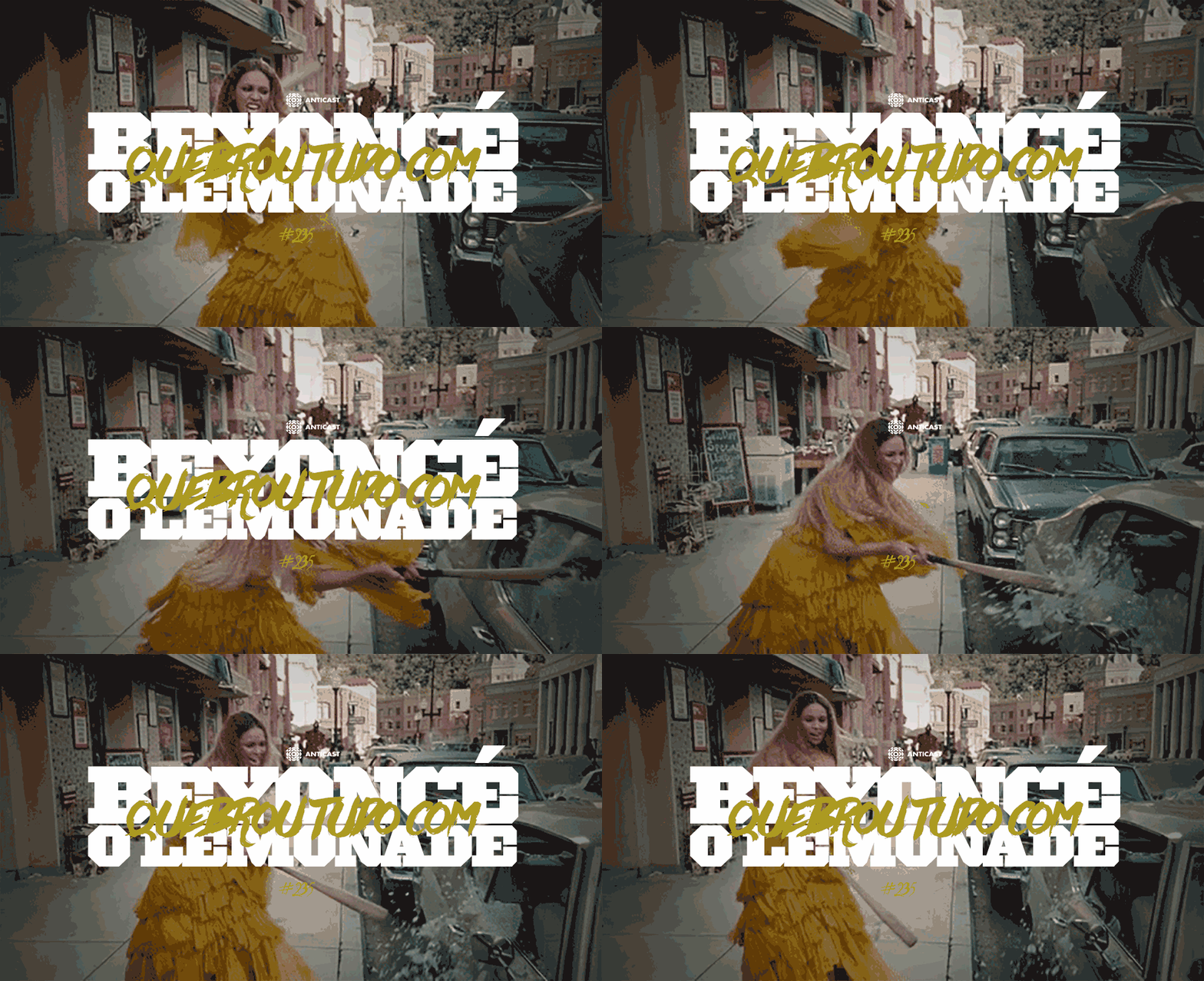
AntiCast 235 – Beyoncé quebrou TUDO com o Lemonade
Posted in: Uncategorized
Olá, antidesigners e brainstormers! Neste episódio, Ivan Mizanzuk recebe os convidados Oga Mendonça (Coletivo Sistema Negro e Blog Per Raps), Mila Félix (Miss Milíssima), Nubiha Modesto, Luiza Braga e Rafael Chino (Lado Black – É Pau é Pedra) para conversarem sobre o último disco da Beyoncé, “Lemonade”. Por que esse disco está sendo tão elogiado? […]
> LEIA MAIS: AntiCast 235 – Beyoncé quebrou TUDO com o Lemonade
 Post originalmente publicado no B9
Twitter | Facebook | Contato | Anuncie
For Facebook and Conservatives, a Collegial Meeting in Silicon Valley
Posted in: UncategorizedThe tête-à-tête at Facebook headquarters was an attempt to mend fences with conservatives, and most said it was a step in the right direction.
De Tijd: #DiningforBrussels
Posted in: Uncategorized

On March 22nd, Belgium was attacked by terrorists. A month later, the impact on Brussels’ economy was enormous. Certainly for the restaurants who saw their business go down tremendously. (bankruptcy rate increased by 1500%). Together with ‘De Tijd ‘and ‘L’Echo’, Belgians national business newspapers, we decided not to sit back and wait, but to do something: we launched #DiningforBrussels.
Julia Meade, TV Pitchwoman on ‘Ed Sullivan,’ Dies at 90
Posted in: UncategorizedBeginning in the early 1950s, Ms. Meade was the elegant public face of products including Lincoln cars, Kodak cameras and Hudnut hair products.
All-Screen Smartphone Concepts – Apple Has Published a Patent for an All-Screen iPhone
Posted in: UncategorizedGetty Images reconstrói rostos de líderes globais sem utilizar uma única foto deles
Posted in: UncategorizedViacom Board Said to End Salary for Sumner Redstone
Posted in: UncategorizedBoard members decided last week to review Mr. Redstone’s compensation after details emerged about his condition at a trial over his mental competency.


