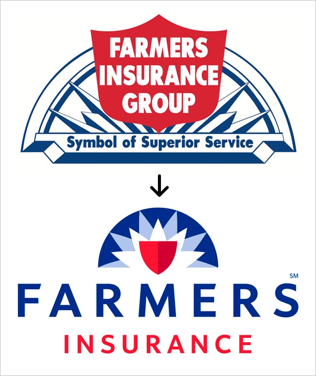
Farmers Insurance Freshens Its Logo, Keeping Sunrise and Shield
Posted in: Uncategorized
Fifty-five years is a good run for any corporate logo, but now Farmers Insurance is replacing its old mark with a new one—keeping several of the original design elements but giving it a sleeker, more contemporary look. The company's first logo, unveiled upon its founding in 1928, featured a sunrise to represent the optimism of a new day. Thirty years later, a shield was added to symbolize protection. That's the way it remained, until now. The new logo, designed in collaboration with Lippincott in New York, keeps the sun and shield—but otherwise has a whole new look. Farmers CMO Mike Linton tells Adweek that it's a "nice evolution." He maintains that a strong logo is critical in distinguishing oneself in today's saturated insurance marketplace. Farmers unveiled the new logo to its sales force at a big meeting in Chicago last week. Asked if logo debacles like Gap's gave Farmers pause in changing its logo, Linton replied, "We researched this to pieces." The company considered hundreds of options in a process that lasted several months, he added.
![]()


