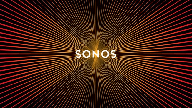
Sonos' Brilliant New Logo Appears to Vibrate When You Scroll Thanks to an Optical Illusion
Posted in: Uncategorized
It’s not easy to capture the idea of sound through visuals. But Sonos has done so quite brilliantly with its new logo, which appears to pulsate when a user scrolls up or down—thanks to an optical illusion with the radiating lines.
Bruce Mau Design in Toronto designed the mark around the idea of amplification—thus, the radiating lines. But the designers only realized halfway through the process that the lines looked like they were emitting sound waves when the user scrolled up or down. Indeed, they say it was a “happy accident,” and once they noticed it, they worked to refine it.
“We didn’t know people were going to notice it so prominently,” says Webb Blevins, vice president of brand design at Sonos. “We’ve done quite a bit of animation studies making that more prominent, but I thought, personally, it was going to go unnoticed.”
Not exactly. Check out lots more about the rebrand at Fast Company and Brand New.
Via Design Taxi.
![]()

Post a Comment