"Portugese Cardilogy Foundation "Tears from the heart" (2016) 1:57 (Portugal)

Portuguese love their salt. So much so that some people think it’s killing them and contributing to stroke and hypertension. For this awareness campaign, FCB Lisbon collected the salt from tears from people still grieving over the loss of their loved ones. And then they took the salt from their tears and bottled it.
Very nice tribute. Although it must be said that scientific study after scientific study is heavily refuting the correlation between hypertension, stroke and heart disease and excessive salt consumption. They are also pointing out that the reduction in blood pressure from cutting salt out of your diet is negligible. So for every one study that says salt is bad, there are three that say otherwise.
Regardless it’s a touching tribute.

Stabilo markers make it easier to highlight what's important

Important words grab our attention when properly highlighted, making it easier to go back for a second read. Neat campaign for Stabilo markers.

EDP – (2011) :60 (Portugal)

EDP - (2011) :60 (Portugal)
Sagmeister Inc. and BNS Energize EDP

NEW YORK – The artists and producers from international production company and design studio Brand New School (BNS) are very proud to present their recent collaboration with international graphic design icon Stefan Sagmeister for EDP Renovaveis, S.A., the renewable energy subsidiary of Energias de Portugal (EDP) and one of the world’s largest and fastest growing wind energy companies.

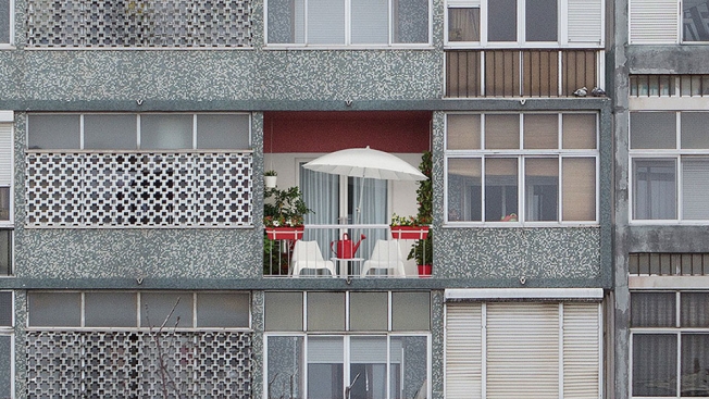
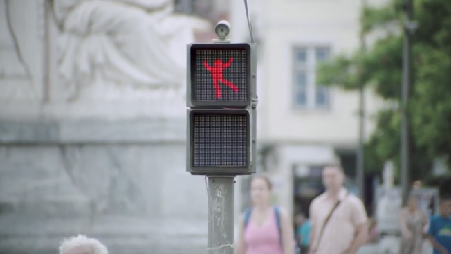
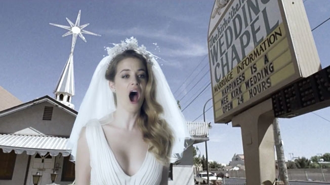
Sagmeister, Inc. has recently created and introduced a strikingly fresh brand identity for EDP. To help introduce it throughout Portugal and beyond, Sagmeister teamed with BNS to develop an animated storyline using the brand new illustrative visual language. The resulting :60 commercial debuted last week on broadcast and cable television in Lisbon, Portugal, and along with many shorter versions, it is set to continue airing widely across the country and Europe for many weeks to come.

“It was such a pleasure to see the identity we created together with EDP become alive through the magic of Brand New School, not only were the results lovely but the process getting there also absolutely enjoyable,” Sagmeister said.

For BNS, the project team featured founder and executive creative director Jonathan Notaro, art director Christopher Palazzo, executive producer Devin Brook, producer Derek Macleod and an illustrious team of designers and artists. The animation workflow involved creating vivid illustrated scenes from EDP’s new branding identity created by Sagmeister art director and designer Jessica Walsh along with others created by BNS. “Bringing life-like behavior to the deceptively simple geometric system created by Sagmeister, Inc. was a fun challenge,” Palazzo explained. “The scope of this system is absolutely astounding. A graphic system this rich and smart can do anything, as shown in the final piece. Stefan and his team were an absolute dream to work with.”

“This collaboration with Sagmeister Inc. is special,” Notaro added. “Obviously he is a design god, and as fans of his work over the years we were all super excited with this collaboration, and looking forward to the next one!”

“EDP” features the song “The Gift.” Additional credits for Sagmeister include illustrators Stephane Elbaz, Xavi Garcia, and Michael Freimuth. For BNS, credit also goes to Flame artist Blake Huber, designer/animators Robin Greenwood and Hye Sung Park, designers Caleb Chalter, Phil Intralligi, animators Scott Balles, Andrew Mastrocinque, and artist Andrew Rothschild.

For more information on EDP and this campaign, please visit www.edp.pt.

About Brand New School
With offices in New York, Los Angeles and London, Brand New School is a vertically integrated production company and design studio that delivers extraordinary media on all platforms. Offering a new model for creative digital production, we are filmmakers, developers, designers, animators, editors, illustrators, and producers dedicated to driving communications to new heights. Akin to leading academic institutions, our guiding philosophies prize experimentation and learning, and our commitment to discovering the best ideas for our clients is absolute. For more information, please visit www.BrandNewSchool.com.

Portuguese Paralympic Committee "Stronger Than Fiber " (2016) 3:00 (Portugal)

Luis Costa is a badass. He was a paratrooper until he got into an accident on his thirtieth birthday and lost a leg. As a testament to where he came from, he decided to tattoo his prosthetic leg. In order to do this, they developed a special tattoo needle made from titanium. The job took nearly 18 hours. Luis is ranked fifth in paracycling. If the Portuguese Paratrooper’s motto is “Never be known as defeated,” Luis is a living breathing testament to that credo. Powerful stuff.

Wunderman Creative Director creates baby case study to announce paternity leave

As a Creative Director, taking even a day off seems like it’s impossible as you’d be asked for input on things, emailed, called up and texted either way. So what do you do when you need to be out of the office for a month? Well, since it’s the Creative Director of Wunderman Portugal, Luís Coelho paternity leave, he had a creative solution to explaining his absence. He would be Out Of the Office to attend to his latest work in progress, his daughter Sofia – and he has the case study board to prove it.

Congratulations Luís Coelho and Mom, Sofia is adorable.

A First Date Proves to Be So Much More in This Touching Video for a Charity

First dates can be awkward, but this night-out scenario, created by agency DLV BBDO Milan for a charity in Portugal, might just leave you in tears.

In a darkened restaurant, with a folksy version of “Have You Ever Seen the Rain?” playing softly, a woman tells her male dinner companion all about her life. “My house is just two blocks away,” she says casually. “I live there with my two cats, and Bat, the dog.” 

She continues, “He’s called that because he’s all black with pointy ears … Oh, and I’m a good dancer. When I was younger, I used to spend all my time dancing in my room on tiptoes. Shall we dance?”

Watch the minute-long clip below before reading further:

read more

Cider Brand Is Broadcasting a 'Live GIF' of a Guy Making the Same Movements for 24 Hours

Livestreaming brand stunts are getting more and more popular—one of our recent favorites being the Waitrose campaign from the U.K. that showed live feeds from the grocery chain’s farms. Here’s a more gimmicky one from Portugal that tries to combine livestreaming with GIFs—or rather, a live-action imitation of GIFs.

read more

PAHC "Radio Sound Therapy" (2015) 2:00 (Portugal)

Portuguese Association of the Hyperactive Child (which I abbreviated to PAHC in the title) is an organization benefiting Portuguese children with hyperactivity. To help, Nylon agency partnered with a national radio station to create radio spots with therapeutic effects. They had some well known Portuguese personalities read some stories while some musicians played Tibetan singing bowls. This sound caused a frequency that
would literally change the beta frequency of our brain waves to an alpha state. As a result the children found it easier to learn and felt more relaxed at night.

Monocole "The woman who chose too much" (2015) 2:00 (Portugal)

Monocle Magazine chose Portugal to host its Quality of Life conference. To honor the fact they were chosen, FCB came up with a character who can never choose anything in this mockumentary. To me the woman represents an average Monocle reader, so in that sense it’s also a deep satire.

This Long-Copy Ad for Condoms Is a 1,000-Word, Single-Sentence Orgasm

Everyone loves a good long-copy print ad. And here’s a clever one from FCB Lisbon for Harmony Condoms that stretches out the phrase “Oh my God” into an impressive 1,000-word sentence. The tagline: “Looong-lasting pleasure.”

Full ad below, via Adeevee.

Click to enlarge.

CREDITS
Client: Harmony Condoms
Agency: FCB Lisbon
Creative Directors: Edson Athayde, Luis Silva Dias
Art Director: Eduardo Tavares
Copywriter: Viton Araújo


Ikea Brightens Up Little Corners of the World in These Fun Print Ads

Ikea nicely contrasts its colorful design sense with the drabness of the world at large in these print ads from TBWA in Portugal. Apparently, going with Ikea means you get a balcony in buildings that otherwise don’t have any.

The approach recalls Jung von Matt/Elbe’s outdoor ads for home-improvement chain OBI. A splash of color in a gray landscape is so good at communicating a freshness of vision.

Full ads below. Via Ads of the World.

Click the images to enlarge.

CREDITS
Client: Ikea
Agency: TBWA, Lisbon
Creative Director: Leandro Alvarez
Art Director: Julliano Bertoldi
Copywriter: Joao Ribeiro
Photographer: Yves Callewaert
Retouch: Whitelab


Smart Car Makes Crosswalks Safer (and More Fun) With Dancing 'Don't Walk' Guy

How do you get people to stop for the “Don’t walk” guy in the crosswalk? Make the “Don’t walk” guy a little more interesting to look at.

That’s what Smart car did in Portugal, giving the icon more entertainment value by getting him to dance for his impatient audience. (This is achieved by seemingly unnecessary though I suppose charming high-tech means—the “Don’t walk” guy imitates the moves of actual dancing humans in a booth nearby.)

The “Walk” guy is really going to have to raise his game.

Via The Denver Egotist.

CREDITS
Client: Smart
Agency: BBDO Germany
Creative Directors: Lukas Liske, Daniel Schweinzer
Director: Marten Persiel


Casa das Histórias

A Casa das Histórias Paula Rego é um museu dedicado à pintora portuguesa que dá nome ao edifício. Localizado em Cascais, Portugal, o projeto foi feito pelo quinto nome da lista “ABC dos Arquitetos”. Eduardo Souto de Moura, ganhador do Pritzker, o Oscar da arquitetura, de 2011.

Souto de Moura iniciou a carreira trabalhando com Álvaro Siza (outro que faz parte do “ABC dos Arquitetos” e responsável pelo projeto da Fundação Iberê Camargo). O arquiteto iniciou sua carreira no começou da década de 1980. Podemos notar que sua obra de influência dos princípios modernistas: valorização da forma geométrica, sobriedade, volumes sólidos.

Casa

.
?
Esse projeto, de 2008, mantêm o partido das formas geométricas. Poderia ser descrito como dois troncos de pirâmides apoiados em prismas retangulares. As fachadas cegas dão ao volume um aspecto monolítico.

Porém, diferente do que se viu na maior parte da produção modernista, branca e acinzentada, a Casa das Histórias Paula Rego foi tingida de vermelho. O tom terracota contrasta com o céu anil e o verde do jardim, uma bela combinação cromática entre arquitetura e paisagem.

Cafeteria

A cafeteria está dentro de um dos troncos-de pirâmide e possui iluminação zenital. O programa do museu inclui 750 m² de áreas de exposição, uma loja, uma cafetaria com esplanada aberta para o frondoso jardim e um auditório com 200 lugares.

A boa arquitetura acontece nos detalhes. No caso de um espaço público, além da preocupação com a proposta arquitetônica é importante pensar em como os usuários irão se localizar e deslocar no espaço. Para esse museu foi contratado o escritório Antônio Queiroz Design para elaborar o projeto de sinalização. Vi isso no blog Sinalizar, quem quiser pode conferir as peças lá.

Por último, deixo vocês com um vídeo do museu, desenvolvido para ser visualizado em iPad, no formato vertical.

????

Casa das Histórias

Casa das Histórias

/fotos por Pedro Kok

Brainstorm9Post originalmente publicado no Brainstorm #9
Twitter | Facebook | Contato | Anuncie

Noooooooooooooooooooo!

Ads for indie film festivals are often quite brilliant. The movies are usually distinctive, so the advertising can be as well. Who can forget Geoffrey Rush as a potato peeler? Or John Malkovich getting all crabby at a cab driver's reaction to his latest film award. The Leo Burnett spot below for Portugal's IndieLisboa fits right into that great tradition. Screw Hollywood. Say yes to an indie movie instead.

CREDITS
Client: IndieLisboa
Product: 10th International Independent Film Festival
Advertising Agency: Leo Burnett Lisbon
Executive Creative Director: Luciana Cani
Copywriter: Steve Colmar / Pedro Pinho
Art Director: Thiago Cruz / Leonardo Pinheiro
Illustration: Bruna Guerreiro / Silvia Rodrigues / Sara Louise Tucker / Mariana, a miserável / Fabio Santos / Douglas Cardoso
Account Director: Tiago Reis
Social Media: Vasco Mendonça / Joana Duarte
Production Director – Agency: Cristina Almeida
Production Company: Stopline
Executive Producer: Francisco Saalfeld
Financial Controller: Nuno Fonte
Line Producer: Inês Marques
Director: Pedro Varela
Creative Assistant Director: Nuno Noivo
Cinematography: Ricardo Prates
Post-production Supervisor: Ricardo Montez
Post-production Company: Illusion
Audio Post-production: Dizplay
Sound designer: João Rola
Voice Over: Marcantónio del Carlo
Original Soundtrack: Xavier Capellas
Additional Footage: VMI/Corbis

Ooda Flat

Le studio portugais Ooda nous propose de découvrir un appartement au design élégant et sympathique. En proposant un filet au-dessus de la montée des escaliers de cet appartement 227 situé à Porto, le studio nous propose un lieu atypique et reposant à découvrir en images dans la suite.

227-14
227-01
227-27
227-13
227-12
227-11
227-10
227-09
227-08
227-06
227-05
227-02
227-04b
227-03
227-01b

Microsoft recruta crianças para demonstrar a simplicidade do Windows 8

Com o Windows 8 assumindo a interface Metro, a Microsoft fez sua decisão mais ousada das últimas décadas. A rejeição por parte dos consumidores poderia ser enorme, tanto é, que o sistema operacional oferece um modo de uso similar as versões anteriores, para quem assim preferir.

Mesmo assim, a empresa quer que o máximo de usuários possíveis adotem a nova interface, vencendo a desconfiança e barreiras que toda mudança traumática causa no início. Portanto, é fundamental que as pessoas entendam que não ficou mais complicado, e o novo Windows é sim bastante simples de usar.

Uma ação realizada em Portugal, na FNAC do Chiado, mostrou isso de maneira bem didática: uma criança é que explicava para os interessados como o sistema operacional funciona. Se a reação das pessoas já é divertida, espere para ver, no final, quando o próprio garoto sai para pedir ajuda. Tudo isso com o simpático sotaque original da língua-mãe.

Windows

Brainstorm9Post originalmente publicado no Brainstorm #9
Twitter | Facebook | Contato | Anuncie


Advertisement

Samsung substitui partituras de orquestra pelo GALAXY Note 10.1

Para promover a flexibilidade de sua GALAXY Note 10.1, a Samsung promoveu o primeiro concerto digital, na Sé Velha de Coimbra em Portugal.

Utilizando o aplicativo +Music, a Orquestra do Norte e o Coro Sinfónico Inês de Castro substituíram as partituras de papel pela tablet. O app, desenvolvido pela própria Samsung, permite ler, editar, criar e compartilhar tablaturas.

Não deixe de notar que, embaixo das tablets, tem as partituras impressas no velho e bom papel. Vai que, né?

A produção é da OSTV, de Porto.

Brainstorm9Post originalmente publicado no Brainstorm #9
Twitter | Facebook | Contato | Anuncie


Advertisement


Samsung promove Galaxy Note com outdoor “vivo” em Portugal

Em Portugal, no bairro do Chiado, a Samsung criou um outdoor vivo. Um artista, que está sendo filmado em algum lugar, atende os pedidos das pessoas desenhando em um Galaxy Note 10.1.

É a versão futurista daqueles cartunistas que vendem caricaturas para os transeuntes, nas calçadas nos centros de qualquer cidade.

Confira mais fotos no Facebook da marca.

/dica do leitor Luis Filipe Spencer Freitas

Brainstorm9Post originalmente publicado no Brainstorm #9
Twitter | Facebook | Contato | Anuncie


Advertisement


Portugal insere QR Codes nas calçadas para promover turismo

A agência MSTF Partners, de Lisboa, em parceria com a BIN e a Lobo Mau, criou uma campanha que combina tecnologia e tradição histórica para promover Portugal mundo afora. Utilizando pedras de calçada e o trabalho dos calceteiros – uma profissão quase extinta -, os criativos elaboraram QR Codes que, quando fotografados, ofereciam conteúdo relevante para os usuários logo após a mensagem: “Acabou de ler o primeiro código QR do mundo feito em calçada portuguesa”.

Mas, fazer isso somente em uma rua de Chiado, em Lisboa, é fácil, pois os turistas já estão lá. Seria preciso levar aquela ideia para outro lugar. Foi assim que começou a remoção das pedras com mais de 500 anos de história para a cidade mais visitada do mundo, Barcelona. Quem teve curiosidade para fotografar o QR Code na Espanha ganhou uma noite grátis em um hotel português.

O vídeo dá a entender que os QR Codes feitos com pedras de calçadas portuguesas serão levados para outros lugares do mundo, inclusive Rio de Janeiro. É esperar para ver.


Brainstorm9Post originalmente publicado no Brainstorm #9
Twitter | Facebook | Contato | Anuncie


Advertisement


Colorful Umbrellas Installation

Une très belle installation de parapluies multicolores dans la ville de Águeda au Portugal. Une rue complète a été entièrement décorée avec des parapluies suspendu et flottant dans les airs, le tout capté en images par la photographe Patricia Almeida. A découvrir en détails dans la suite de l’article.

umbrellas02
umbrellas03
umbrellas04
umbrellainstallation02
umbrella00
umbrella01
umbrellainstallation01
umbrellas1