Is Olive Garden’s New Logo as Wretched as Everyone Says?

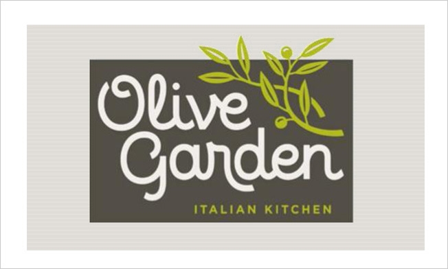
If you thought Olive Garden's logo couldn't get any worse, you were wrong.

On Monday, the Darden-owned restaurant chain unveiled a brand refresh. The perplexing cluster of grapes that graced Olive Garden's logo for a decade and a half has devolved into a twiggy branch that appears to be an unfortunate shade of chartreuse. The previous tacky pseudo-script laying out the chain's name has become a font that's even more half-baked.

The early feedback is not good. One Twitter commenter aptly describes the overall design as looking "like it was drawn with a breadstick." Another interprets the new logo, created with help from design shop Lippincott, as a sign that the restaurant will "now be a home decor company specializing in mid-priced hand towels."

John Brownlee at Fast Company offers a detailed takedown of the color scheme in a side-by-side comparison with the old logo.

Sure, beauty is in the eye of the beholder, and logo redesigns can be a notoriously touchy business. But this could easily be on par with the notorious Gap crowdsourcing and Target drop-shadow debacles—or it would if people cared as much about Olive Garden as they do about Gap or Target.


If NFL Logos Were Hipsters

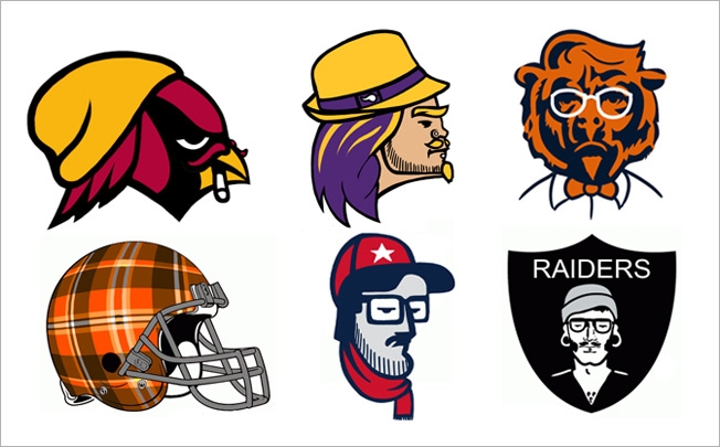
If you were to draw a Venn diagram of hipsters and the NFL, the circles would likely overlap in just one tiny spot: this oddly fascinating project from comic artist Dave Rappoccio.

"What if the NFL logos were hipsters?" That was the hypothetical question Rappoccio embraced with admirable intensity, redesigning all 32 team icons into celebrations of bearded, craft-beer-infused pseudo-intelligentsia.

Artistically, some are better than others. I'm specifically fond of the fedora-sporting Vikings, bow-tied Bears and embittered, sock-hatted Cardinals. The Starbucks-inspired Seahawks design is great, too, but since no hipster would be caught dead in a corporate chain, I assume it would be worn only ironically.

Check out the full gallery at Kissing Suzy Kolber.


Advertising: For Journalists Who Seek Out Hidden Things, a More Visible Brand

As it finds new ways to expand its activities, the Center for Investigative Reporting is unveiling a new logo and marketing campaign.


Innovation: Who Made That Android Logo?

Finding inspiration for a robot on a bathroom door.


Brands Come Together Through Logo Mashups

When the Tumblr community isn't misunderstanding social justice or letting alcoholic grad students explain themselves via TV-show GIFs, they're mashing things up. Logo Mashups, for instance, takes two somehow related brand logos and puts them together, which is funny when the two brands have little in common. The IHOP/Playboy pairing gave me the best/worst idea for a Hooters-style pancake house, but there's not much else to say about projects like these beyond "here are some logos." That's the problem with mashups; even the clever ones are just reminders of someone else's creative work.


And Finally, Here It Is: Yahoo’s New Logo

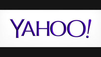
After "30 Days of Change," Yahoo rolled out a new logo at midnight ET on Thursday, introducing a design that wasn't one of the 29 previously floated throughout the past month. Instead, it's a completely new design—one that CEO Marissa Mayer explains at length in a blog post titled "Geeking Out on the Logo." She writes:

One weekend this summer, I rolled up my sleeves and dove into the trenches with our logo design team: Bob Stohrer, Marc DeBartolomeis, Russ Khaydarov, and our intern Max Ma. We spent the majority of Saturday and Sunday designing the logo from start to finish, and we had a ton of fun weighing every minute detail.
    • We knew we wanted a logo that reflected Yahoo—whimsical, yet sophisticated. Modern and fresh, with a nod to our history. Having a human touch, personal. Proud.
    • Other elements fell quickly into place:
    • We didn’t want to have any straight lines in the logo. Straight lines don’t exist in the human form and are extremely rare in nature, so the human touch in the logo is that all the lines and forms all have at least a slight curve.
    • We preferred letters that had thicker and thinner strokes – conveying the subjective and editorial nature of some of what we do.
    • Serifs were a big part of our old logo. It felt wrong to give them up altogether so we went for a sans serif font with “scallops” on the ends of the letters.
    • Our existing logo felt like the iconic Yahoo yodel. We wanted to preserve that and do something playful with the OO’s.
    • We wanted there to be a mathematical consistency to the logo, really pulling it together into one coherent mark.
    • We toyed with lowercase and sentence case letters. But, in the end, we felt the logo was most readable when it was all uppercase, especially on small screens.
    Our last move was to tilt the exclamation point by 9 degrees, just to add a bit of whimsy.

Check out a video about the new logo below. What do you think of it?


Yahoo Will Unveil a New Logo at Midnight. Do Any of These 30 Options Beat the Original?

[UPDATE: And here is the new logo!]

Yahoo is just hours away from that terrifying moment for any brand: the unveiling of a new logo. But the company has approached this rebranding a little differently.

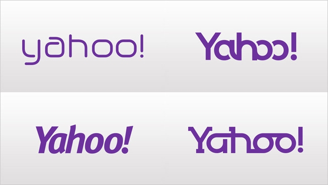
A month ago, it launched "30 Days of Change," a project in which it unveiled a new logo each day—displaying each one on its homepage and throughout its network in the U.S. "It's our way of having some fun while honoring the legacy of our present logo," Yahoo said.

The project has now featured 29 logos. The 30th, set to be introduced tonight at midnight ET/9 p.m. PT, will be the company's official new logo. Yahoo has not said whether No. 30 will be one of the previous 29, or a completely new mark. (If it's one of the earlier ones, then this whole thing appears to have been an elaborate focus-group test—wise, perhaps, given the vitriol that greets many new corporate logos.) This much we do know: "We'll be keeping the color purple, our iconic exclamation point and of course the famous yodel," says the company. "After all, some things never go out of style."

Whatever the case, it's worth looking at the 29 and asking if any of them is an improvement on the original. (Apologies for leading the witness, but we should mention that the Day 10 logo has fared best among the public, according to polling site Polar.) In fact, we have a 30th option to consider, too—as 99designs held its own unofficial contest to develop a new Yahoo logo, and has picked a winner.

So, below, check out Yahoo's 29 options from the past month, plus the 99designs victor. And tell us: Should any of them actually be the new Yahoo logo?

Day 1

Day 2

Day 3

Day 4

Day 5

Day 6

Day 7

Day 8

Day 9

Day 10

Day 11

Day 12

Day 13

Day 14

Day 15

Day 16

Day 17

Day 18

Day 19

Day 20

Day 21

Day 22

Day 23

Day 24

Day 25

Day 26

Day 27

Day 28

Day 29

99designs winner


Farmers Insurance Freshens Its Logo, Keeping Sunrise and Shield

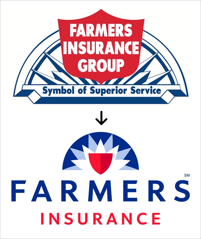
Fifty-five years is a good run for any corporate logo, but now Farmers Insurance is replacing its old mark with a new one—keeping several of the original design elements but giving it a sleeker, more contemporary look. The company's first logo, unveiled upon its founding in 1928, featured a sunrise to represent the optimism of a new day. Thirty years later, a shield was added to symbolize protection. That's the way it remained, until now. The new logo, designed in collaboration with Lippincott in New York, keeps the sun and shield—but otherwise has a whole new look. Farmers CMO Mike Linton tells Adweek that it's a "nice evolution." He maintains that a strong logo is critical in distinguishing oneself in today's saturated insurance marketplace. Farmers unveiled the new logo to its sales force at a big meeting in Chicago last week. Asked if logo debacles like Gap's gave Farmers pause in changing its logo, Linton replied, "We researched this to pieces." The company considered hundreds of options in a process that lasted several months, he added.


Emerging from the Logos

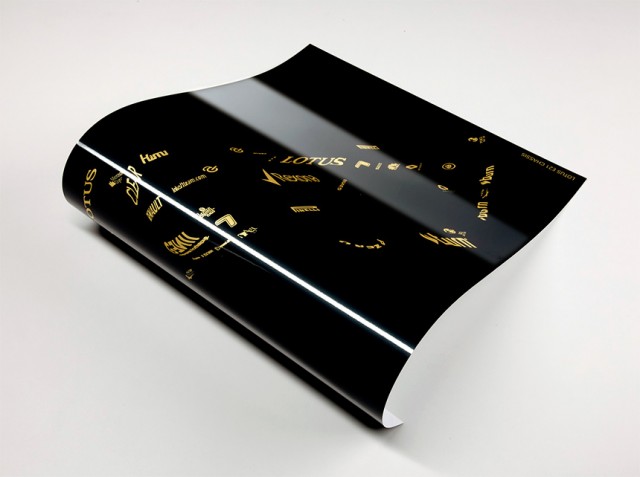
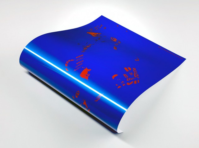
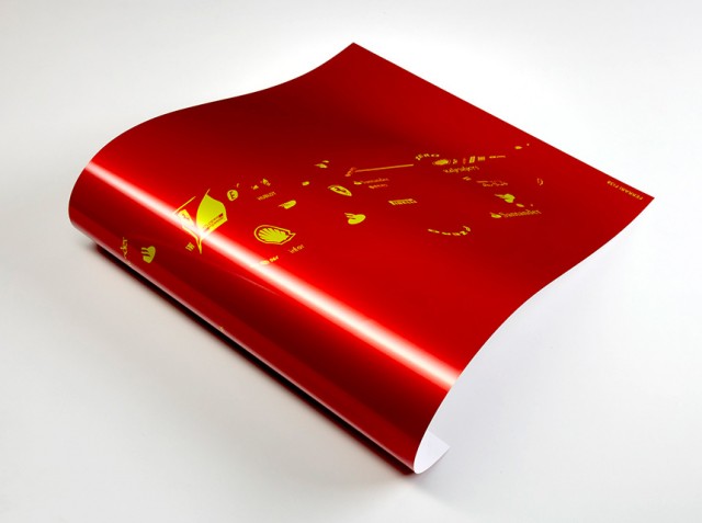
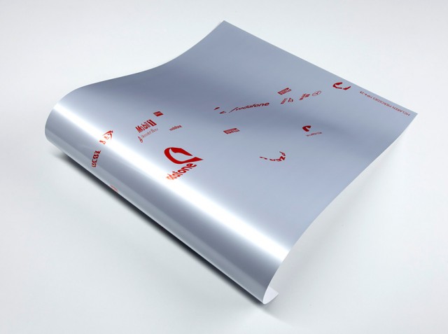
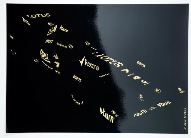
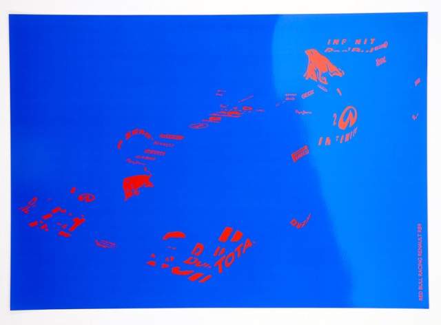
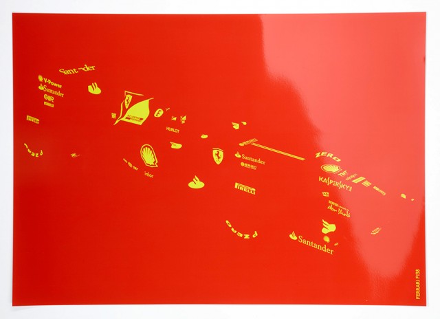
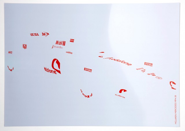
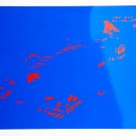
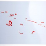
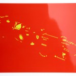
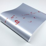
« Emerging from the Logos » est une série de posters imprimés « en édition limitée » représentant uniquement les sponsors des différents modèles de voitures de Formule 1. Imaginées par le londonien Yoni Alter, ces visuels composés de logos permettent de deviner la forme des monoplaces Red Bull, Ferrari ou encore Lotus.

Emerging from the Logos-4
Emerging from the Logos-3
Emerging from the Logos-1
Emerging from the Logos-2
Emerging from the Logos-5
Emerging from the Logos-7
Emerging from the Logos-6
Emerging from the Logos-8

Hidden Message in New Wendy’s Logo Is So Subtle, Not Even Wendy’s Noticed It

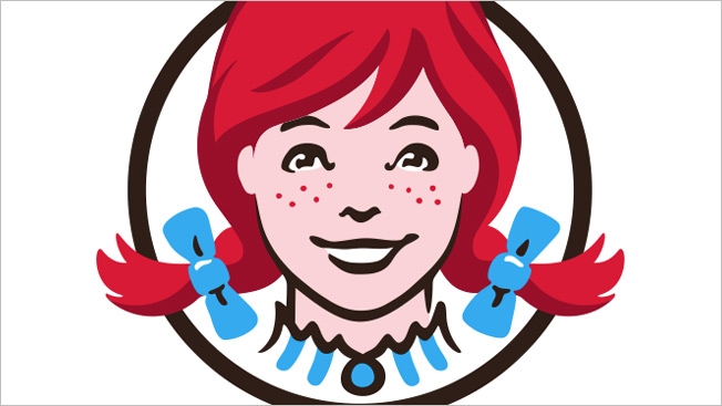
StockLogos recently suggested that Wendy's sneakily put the word "mom" in the Wendy character's collar in the chain's new logo—to subliminally associate the brand with motherly cooking and the "safe and loving environment" of home. In short, Wendy's says nope. "We are aware of this and find it interesting," Denny Lynch, the company's svp of communications, tells the Huffington Post. "We can assure you it was unintentional." That's all well and good … but her hair still looks like a grassy knoll, and I could swear those freckles spell out "Paul is dead," more or less, if you look at the logo while jumping up and down and squinting. Her eyes kind of follow you around, too, all menacing and killy. That's it—I'm switching to Burger King.


Estúdio Maentis faz releitura honesta de logos

Imagine se marcas como McDonalds, Lacoste e Apple tivessem logos que correspondessem um pouco mais à realidade de seus produtos. Adicione um toque de humor ácido e pronto: temos Universal Unbranding, divertido projeto criado pelo estúdio Maentis que faz uma releitura honesta de logos e símbolos conhecidos.

No caso dos anéis olímpicos, por exemplo, nem tudo é união dos povos e espírito esportivo, enquanto sobram gordurinhas no M de McDonalds. E o símbolo da paz pode ser facilmente transformado em um mira.

O bacana deste projeto é que ele usa o humor para criar aquela sensação de incomodo que nos leva à reflexão, independentemente se concordamos ou não com as interpretações dadas.

maentis03 maentis08 maentis09 maentis02 maentis07 maentis01 maentis06 maentis11 maentis12 maentis14 maentis05 maentis16 maentis04 maentis10 maentis13 maentis15 maentis17 maentis18

Brainstorm9Post originalmente publicado no Brainstorm #9
Twitter | Facebook | Contato | Anuncie

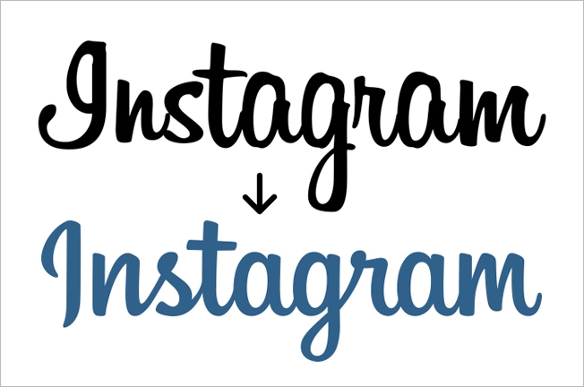
Instagram Refreshes Logo, Becoming Instagram Instead of gnstagram

Instagram has a new logo, and it's lovely. In particular, the "I" at the beginning looks more like an "I," but the company kept a script-style font (a nod to the brand's love of all things nostalgic) and generally cleaned it up a bit. Designer Mackey Saturday worked with Instagram on it, and explains more here:

I had the opportunity to work with the fantastic team at Instagram to create their new logo. It has been a long time coming, and I'm honored to share the result with you. It was always essential that the design maintained everything that we've all grown to know and love about Instagram while creating a logotype that was more refined, durable, and that positioned the brand for expansion. Looking to the past to inspire the future, the script connects with the nostalgia that Instagram was built from, maintains the important character of the original typeface, and places the brand in a unique and prominent position both in the current and future landscape.

Some more images from Mackey after the jump.


Little Debbie’s Logo Change Is So Subtle, It Becomes a Spot the Difference Game

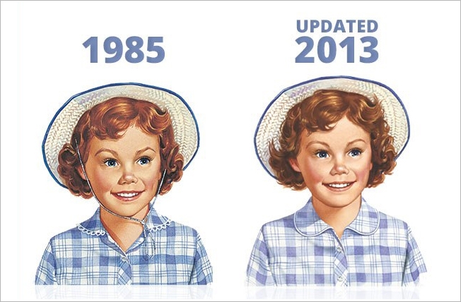
Little Debbie did not consult with Gap, JCPenney or any other noted logo overhaulers before updating its own logo—the first tweak to the design since 1985. The change is remarkably subtle, so much so that the dessert-snacks brand is challenging its fans on Facebook to see how many differences they can find. "Leave a comment with the changes you can spot, and share it with your friends to see how keen their eyes are," the brand says. For hints, check out the 1,200 comments left so far.

UPDATE: Below, check out the original 1959 photo of Debbie McKee, and the first logo, from 1960, which was based on the photo.


Lionsgate Updates Its Animated Logo

Studios regularly update their logos, but Lionsgate, looking to underscore its growth, adopted a radically different one.


Descubra quanto custaram alguns logotipos famosos

O site StockLogos publicou, recentemente, uma lista mostrando quanto custou para algumas das principais marcas do mundo seus logotipos. Os valores são surpreendentes. Alguns, por serem baratos demais – é o caso do Google original, que aparece com custo zero, já que foi criado em 1998 por um dos fundadores da empresa, Sergey Brin. Outros, por serem incrivelmente caros. Mas, daí entra aquela questão: como precificar seu trabalho? Se levarmos em conta que aquele logotipo terá ampla exposição, especialmente quando representa marcas de grande alcance mundial, será que $ 100 milhões realmente é caro demais?


O logotipo original da Coca-Cola foi criado por Frank Mason Robinson, em 1885. Como ele era escriturário da empresa, o custo foi $ 0.

Recentemente, o logotipo do Twitter passou por mudanças. Mas, lá em 2009, quando foi criado por Simon Oxley, ele custou $ 15.

Carolyn Davidson criou o logo da Nike em 1975, por $ 35. Alguns anos depois, a Nike também cedeu 500 opções de ações para Carolyn, que atualmente valem mais de $ 600 mil. Mesmo tendo passado por algumas modificações ao longo dos anos, o conceito original sempre foi mantido.

Steve Jobs pediu a Paul Rand que criasse ao logotipo da NeXT em 1986. Para isso, ofereceu $ 100 mil ao designer.

Wolff Ollins assinou em 2007 o logotipo da Olimpíada de Londres. Preço: $ 625 mil.

$ 1 milhão foi o preço cobrado pela Arnell Group em 2008 pelo novo logotipo da Pepsi.

O logo da BBC passou por um redesign em 1997. O preço? $ 1,8 milhão.

Em 2000, a Landor Associates cobrou a bagatela de $ 100 milhões pelo novo logo da Accenture.

Brainstorm9Post originalmente publicado no Brainstorm #9
Twitter | Facebook | Contato | Anuncie


Advertisement


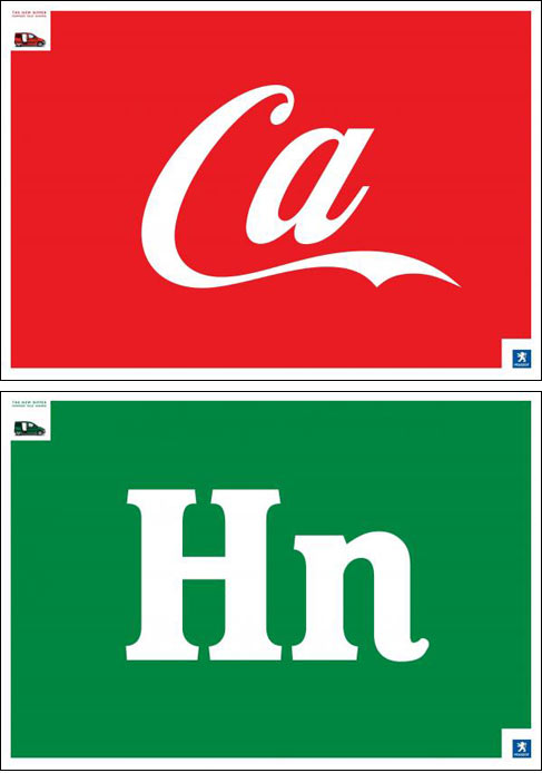
Creative Shortcut? / Un peu court comme nouveauté?

smalllogo1 smalllogo2
THE ORIGINAL?
Peugeot Bipper “Downsize your business” – 2008
Source : Coloribus
Agency : Euro RSCG Worldwide (Spain)
LESS ORIGINAL
TVN “shorter commercial breaks” – 2011
Source : Cannes BRONZE LION
Agency : Lowe Porta (Chile)

Um pai faz uma incrível experiência de Branding e Design com a filha de 5 anos

Um pai resolveu fazer uma experiência com a filha de 5 anos de idade, mostrando a ela uma série de logos que ela não estava familiarizada. A menina teve apenas 5 segundos para olhar para cada um deles, e depois teve que desenhá-los, buscando as referências na própria memória.

Dessa forma, é possível perceber em muitos casos como um determinado elemento marcou a mente dela em apenas 5 segundos. E o resultado dessa experiência é brilhante.

Recentemente, a Amanda de Almeida postou algo muito similar no B9. E todas essas experiências só me levam a crer que, quando falamos em simplicidade na estética e no conceito, devemos perceber que esse simples é essencialmente visceral. :)

Brainstorm9Post originalmente publicado no Brainstorm #9
Twitter | Facebook | Contato | Anuncie


Advertisement


Logos famosos são analisados por garotinha de 5 anos


O designer Adam Ladd desenvolveu um curioso projeto com sua filhinha de 5 anos no último fim de semana: colocou a garotinha para analisar alguns dos logos mais conhecidos do mundo. O resultado você vê no vídeo abaixo: uma mistura de fofurice com interpretações bastante autênticas sobre as imagens. A gente ficou imaginando o que ela diria a respeito de algumas campanhas que rolam por aí…

Confira e escolha suas impressões favoritas.

Brainstorm9Post originalmente publicado no Brainstorm #9
Twitter | Facebook | Contato | Anuncie


Advertisement


Aol. Animations

Baseada em Nova Iorque, a Wolff Olins é uma das mais conceituadas empresas de branding e inovação. No início dessa semana, eles lançaram uma série de vídeos para divulgar o rebranding da Aol.

Os vídeos fazem parte de uma veiculação especial em meios digitais (vídeos na internet, mobile e outdoors de LED).

A Universal Everything foi comissionada para colaborar com a produção dos vídeos.

Carrefour com nova logomarca e campanha

carrefournew.jpg

Com mais de 15.000 lojas em 35 países, gerando bilhões em vendas, a cadeia de supermercados francesa Carrefour é inegavelmente um dos varejistas mais proeminentes do mundo.

Carregando a mesma logomarca desde 1966, a varejista resolveu dar uma leve mudada na forma e concepção do seu tradicional “C” estilizado.

Para quem não sabe, a logomarca do Carrefour diz respeito à sua origem, na França, em 1959. A primeira loja foi aberta na cidade de Annecy, perto de um cruzamento (em Francês, “carrefour”), e a logo consiste de duas setinhas, representando essa encruzilhada, e suas cores (vermelho, branco e azul) representam as cores da bandeira francesa, com o claro formato da letra “C” na cor branca. [wikipedia]

Eu, particularmente, nunca gostei da logomarca do Carrefour, e confesso que sempre eu me perguntava o porquê da conservação de uma identidade visual tão imutável. E no começo de setembro, junto com uma nova campanha intitulada “Positive is Back“, o Carrefour lançou uma nova logomarca ligeiramente modificada.

Mudança: Velho (amarelo) e sobreposição do novo (azul)

carrefour_icon_comparison.gif

O novo ícone parece não querer perder muito a velha forma já tão conhecida e perceptível no mundo.

A maior mudança, mais do que a forma ou a tipografia, é a introdução de uma gama de cores gradientes para o ícone, como você pode ver na página do Facebook [aqui].

Os primeiros comerciais desta nova campanha levam mensagens de otimismo aos franceses, numa busca por melhorar a vida de seus clientes. Veja alguns dos filmes [aqui].

:: Via BrandNew